MixCité

Client
Portfolio Project

Scope

Packaging System Design

Year
July 2024

Location

Montréal, Canada

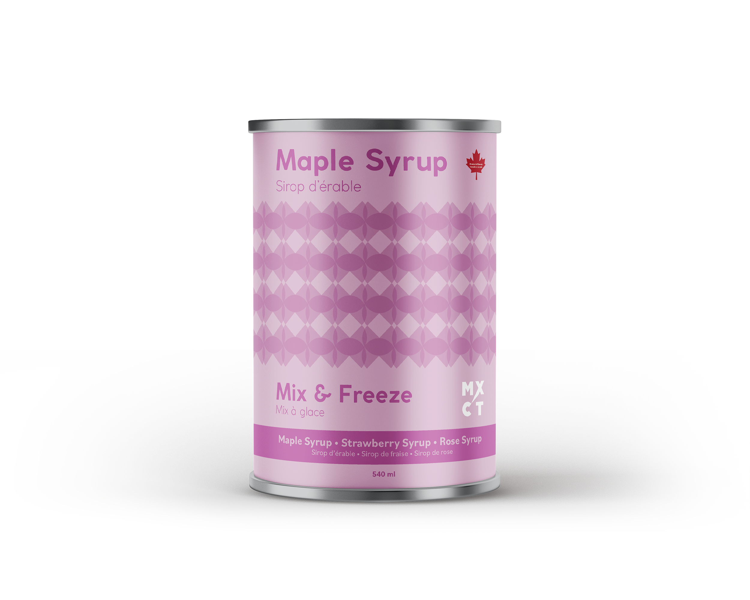
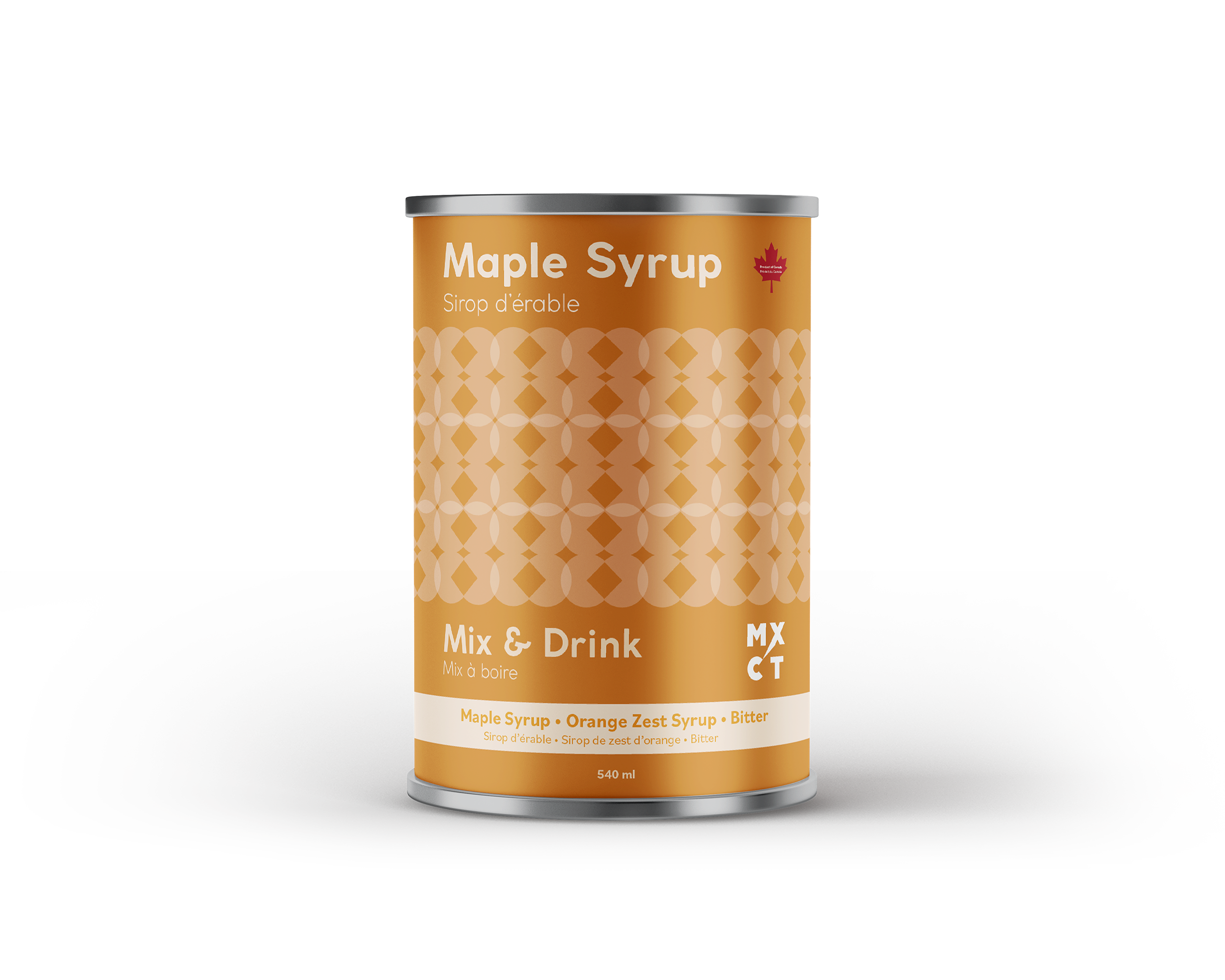
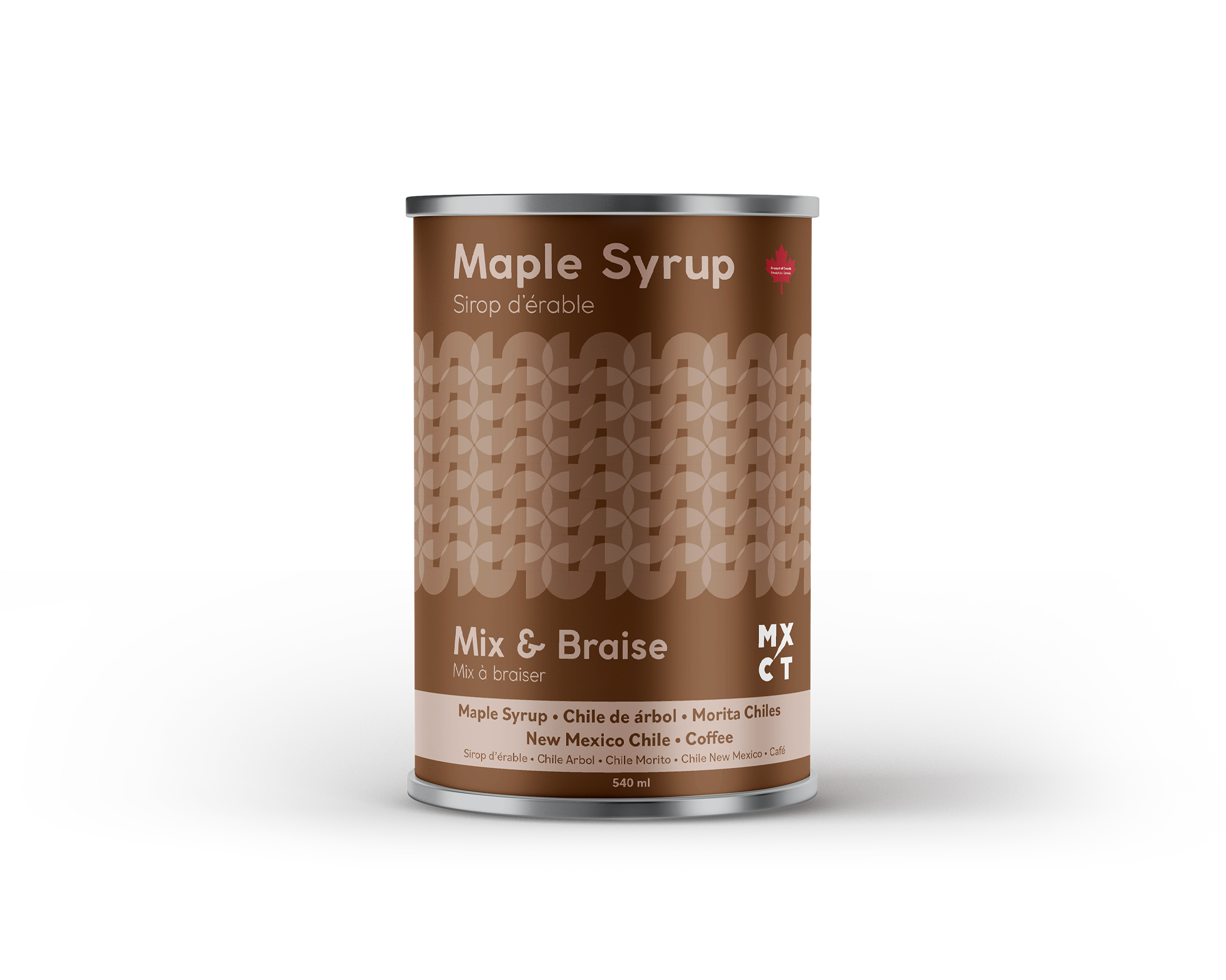
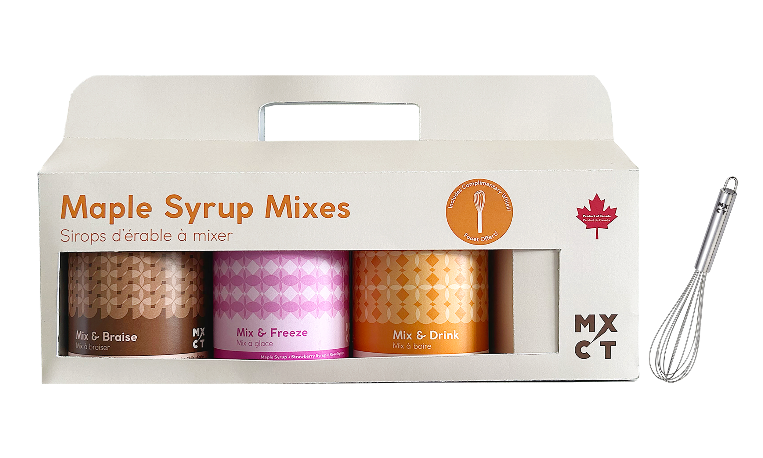
In collaboration with Montréal-based blog MixCité, this project reimagines maple syrup packaging. The eclectic flavor mixes offer a contemporary take on a Canadian classic by reflecting its cultural diversity. 

A cylindrical can of maple syrup with a pink geometric design, the words 'Maple Syrup,' 'Mix & Freeze,' and flavor options listed, sitting on a gray surface.Made by Alexia Chammas, Atelier Kib.
A cylindrical can labeled "Maple Syrup" with a red maple leaf logo, featuring an orange and white geometric pattern, placed on a gray surface against a black background. Made by Alexia Chammas, Atelier Kib.
A can of maple syrup with a brown label on a gray surface against a black and brown background.  Made by Alexia Chammas, Atelier Kib.
An Instagram post showing four different product advertisements for syrup flavors in cans, with the central phone displaying a pink-themed syrup product with the text 'Re découvrez le sirop d'érable avec nos nouveaux produits 'a mixer'.
A white box with three cans of maple syrup mixes labeled 'Mix & Braise,' 'Mix & Freeze,' and 'Mix & Drink' inside. The box has orange and red text and a Canadian maple leaf symbol. There is a whisk attached to the right side of the box.